
Our blog consists of different types of posts which presents our work throughout the time we spent on making our teaser trailer, magazine cover and film poster. For example, we scanned our sketches of the magazine cover, film poster and storyboard of the trailer so that we were able to upload them onto blogger. We did this buy scanning them into Photoshop then saving them as jpeg images. We thought that this needed to be done as it was an important part of our planning and research method. Based on the preferences of our potential consumers, we constructed these sketches to plan what our final pieces would look like. We also posted images of some of our team members during practical work on preliminary filming and setting up equipment. On our blog there are videos of test shots, tutorials and rough cuts that show some of the things we learned and also situations where we had to experiment with things in order to see what worked best for what we wanted to produce, which was a psychological horror teaser trailer.

Before making decisions on what our teaser trailer would include, we watched some well known horror film trailers. We did this by using the internet and accessing video clips from youtube. Whilst doing this, we came up with an idea that we would make our group youtube account so we could upload all the videos that we produced on there. Also we had to because this is how we would gain constructive criticisms and feedback from other people. To also help us with ideas on how to construct our magazine cover and poster, we accessed real magazine covers and posters using google and visiting film sites that specialised in the theme of horror; which can be seen by clicking here.


Written by: Christina
PRODUCTION (construction)
 |
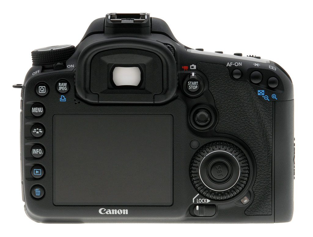
| Canon 550 camera |
In the production stage of creating our media products we used a variety of different (primarily digital) technologies to help us create the desired, and most professional effect possible.
Before filming we decided to shoot some test shots of what is was that we planned to film which turned out rather similar to the shots that we actually chose to film. Not only did these test shots give us an opportunity to get some practice with our shooting skills and come to terms with some of the potential problems we could face but they also enabled us to figure out how we could make the shots more interesting for example this particular test shot was developed for our finished teaser trailer as we knew to add a different variation in props on the table to give it a much more realistic effect.
On the first occasion that we chose to film, we used the Canon 550 camera, a kino-flo light and one LED light. Looking back on it now this sounds like a disaster that was waiting to happen. I say this because as we discovered after filming the camera had a hard time trying to focus as there just wasn't enough light for it to pick up a clear enough image. This mishap enabled us to learn from our mistake and realise that low-key lighting doesn't necessarily mean dark.
The day we filmed the footage that we actually used in our teaser trailer we used the Canon 7D which was much more successful as not only
 |
| Kino-flo light |
Although they are not digital technologies the use of the kino-flo and LED lights played a monumental role in the finished product that is now our teaser trailer. Not only did they help to keep all shots in focus but they aided us in 'setting the scene' for our trailer.
 |
| Canon 7D camera |
The Canon 7D camera itself didn't make much of a difference in comparison to the 550, but it is another prime example of how the use of digital technologies made a difference to our finished media products as filming without a digital camera would have been much more time consuming especially with the fact that we had to film on more than one occasion.
 |
To top it off and give our trailer that extra modern feel which would help our audience connect with our film we chose to incorporate an iPhone 4 into our trailer too which is also an example of a push technology (although in this case we only used it to make a phone call).
 |
| Screenshot of our camera setup tutorial |
The third and final camera we used to create our media products was the Canon 400D, this was used to take the photographs for our movie magazine front cover and poster. The flash that was attached to the camera (which was also a digital technology) made the whole experience of taking pictures much more efficient as it meant that we didn't have to concentrate on the lighting in so much depth, as was the case when we filmed.
When taking these pictures we thought it would be useful to photograph the same pictures from different angles in order to give us similar shots but with variations in lighting.Written by Gabrielle
POST-PRODUCTION (construction)
Magazine
With all the knowledge we gained from learning how to use equipment, making and following tutorials we took photos using the Canon 550D camera, before putting together the magazine cover and the poster. As well as doing so, we had to make sure the pictures were suitable for our products.
We planned a fixed time of roughly 1 hour and 30 minutes because we wanted to take photos for both the magazine and poster. This took a while because we constantly had to re-position the kino flo lights in order to create the best lighting for the image. We used the Canon 550D camera to take these photos and we used other technologies such as, the flash to help us achieve the best result.
During the photoshoot we had to be aware of the various safety issues when dealing with the digital equipment. For example, we had to make sure that if we were to use the kino flo lights, we would always hold on to it from the back to avoid electrocution. Also, we had to consider small situations such as, making sure there was enough space to work with the shooting equipment. This was to insure that we could work with equipment comfortably in order to avoid damaging of the products and injuries of the individuals working around us.
The magazine cover was made by using Photoshop. As a group, we were quite used to how Photoshop worked, and as an individual I felt comfortable with creating this piece using this software. Personally I didn't seek help from looking at Photoshop tutorials to help with the construction of the magazine cover. In our group we all had our past experiences with Photoshop and we were really familiar with it. In fact, we all found that creating this magazine cover using Photoshop, enabled us to build up on our Photoshop skills and learn more. Even though we had to use this to construct our media product, we still used this opportunity to improve our knowledge of this software from what we knew at AS level, so that our magazine cover would have shown the great difference between our knowledge of the software now compared to last year. We knew that if we achieved this, then our magazine cover would look very appealing and realistic.
 In addition to the use of Photoshop, we also used the website http://www.dafont.com/ to download many fonts so we could try them out and see what would look good for the font of our masthead. This was very easy to do because we knew how to download and install the fonts on photoshop. This website was very useful for us because, it has different themes that the fonts come under. It made it easy for us to search specifically for what we wanted because it had themes such as, Horror, Dark, Gothic, Sans Serif etc - and these were the types of font we were looking for to put on our cover.
Written by Christina
THE ROLE OF DIGITAL TECHNOLOGY
http://prezi.com/qcoeldyyqb5e/present/?auth_key=j118f6q&follow=1ov3tl2nsm38
by Cyprian Boateng
EVALUATION (POST PRODUCTION)
Following the production of our media product, we used a wide range of digital technologies to aid us in creating our teaser trailer and the products connected to it. Upon filming the necessary shots needed for our teaser trailer, we began the editing process with the editing software ‘Final Cut pro’. We had many aims and targets with Final cut pro, one of which was to learn how to edit with final cut pro. We learnt how to by firstly going onto youtube and looking at online tutorials on how to edit film with final cut pro. We then subsequently obtained advice from our teachers on how to improve our editing skills.
 Fig 1. Final Cut Pro logo compatible only with Apple computers
Final cut pro is a non-linear video-editing software developed firstly by Macromedia Inc and now Apple Inc. Final cut is very popular with independent filmmakers and many video hobbyists because it’s a much cheaper option then filming on a 35mm camera and editing a long tangible reel of film. It is now starting to become popular with many major film companies with big films such as No Country for Old Men, Black Snake Moan and The Ring being edited with final cut pro
After uploading our camera shots onto an iMac, we opened up Final cut pro and imported our camera shots. A skill we learnt using the final cut pro software was the ability to import our shots onto our timeline. This skill was important because it allowed us to begin the editing process of our trailer. Furthermore another skill we learnt was how to use video transitions such as cross dissolve and fade in fade out transition which allowed us to change between each shot smoothly. This was difficult because at first for example, the fade in fade out transition we were using in the shots did not give us the desired effect we wanted. However we overcame this by learning another skill which was changing the key frame of each transition to either prolong a transition or simply cut it short to our desired effect. The fade in fade out transition was essential for our teaser trailer because it allowed us to carry out a connotation of suspense in our trailer. Without it we would have not been able to create the right amount of suspense for our particular horror subgenre; psychological/supernatural.
The original shot without a fade
The shot with a fade transition
Furthermore a skill I personally learnt was how to reverse a shot in order to avoid any unnecessary jump cuts. This was important because previously the shot itself stuck out a bit in terms of before in the previous shot, the phone was on the table, in the next shot the phone would have been in the characters hand with no real visual explanation. Reversing the shot allowed us to keep the sense of continuity.
How it was before
How it is now
Another skill I also learnt was how to add captions to our teaser trailer. However this proved to be challenging because of the fact the original captions were not spectacular and did not aid in building/cooling suspense. However I overcame this difficulty by using another editing software called Motion Inc. This editing software allowed me to put on an effect onto the text I created called ‘Ethereal in’ which created a bright yellow glow on the captions. This effect created a connotation of warmth, which I believe to be a moment of dark humour in the teaser trailer due to the fact that the films title ‘Subdued’ connotes darkness, a juxtaposition of warmth.
Example of caption
Our actually moving logo
We then exported our trailer to a software called 'soundtrack pro' so that we could add some Foley sound to our project.
 |
| Fig 2 Soundtrack Pro Logo |
Soundtrack pro is a music composing and audio editing application made by Apple inc, which includes just over 5000 free professional instrument loops and sound effects.
A skill we learnt using Soundtrack pro firstly, was how to import out finished final cut pro document onto the soundtrack pro time line. This allowed us to see where to put each sound to perfection, according to each individual shot. Another valuable skill we learnt was how to cut the various sounds that we used for our trailer so that it fitted our trailer much more. This allowed us to shorten and extend sounds, which was vital for us because for example, the sound we used for our logo animation was previously longer then our logo however by cutting it shorter, it fitted our logo well.
Video of our sound
After we finished creating our trailer, we began to construct our poster. We used the same software we used to create our music magazines from last year, which was Photoshop. This allowed us to put into practice the skills we acquired from last year. For example a small yet significant skill we practised was how to move images onto the canvas. This skill though small was important because it allowed us to begin the editing process of our trailer and add our production logo to the poster. A new skill we learnt this year was the lens correction and darken effect. This effect was crucial to us because it allowed us to darken the image background. This allowed us to create the connotation of darkness which relates back to the movie title ‘Subdued’ and the main theme of the trailer. Furthermore another skill we practised was how to add text to our image. This allowed us to construct our movie title. Furthermore another skill we practised was lawfully downloading text from the website www.dafont.com which allowed us to change the font of our title to make it look more like a horror poster and create our credits with a special called ‘Steeltongs’; a font used in many real-life film posters.
Furthermore a skill I personally learnt was how to lighten an image. When I imported our production company logo onto the poster, I found that the original version did not fit the poster and made it look very tacky because the poster background was not black. By making the logo lighter, it fitted our poster much more.
 |
| Our finished product |
No comments:
Post a Comment